A civic engagement app to participate in projects within Toronto.
A group of 4 students and I were tasked with creating a website, as well as a mobile and smartwatch application related to the notion of smart cities for a user interface course. Through a discussion with our group members, we discovered the necessity of a more “meta” sort of project to help inform how these smart cities plans could be implemented in cities. As such, we created EngageTO, a civic engagement platform that allows citizens to speak their minds about projects in Toronto. This was showcased through a platform that allows users to fill out surveys and follow-up questionnaires about projects happening in the city that are relevant to their interests, and to gain rewards for their responses. The platform would be active online through a web interface, as an iOS application, and as an Apple Watch application.
Ideation:
Several assumptions were made during our design process: the City of Toronto would have a user research/experience team that would champion this project; numerous city departments would partner with this team to utilize the platform; and that the City of Toronto would open up the data they receive. As well, the team recognized risks such as low retention of users, more users than projects, and the high cost to build this platform.
The group wanted the user interface to be easy to use and to allow for easy wayfinding through a strong sense of information architecture. We wanted users to feel satisfied using the platform, and make sure that feedback was given to users when utilizing EngageTO.
Our conceptual model for EngageTO used metaphors and analogies such as matchmaking, where users create profiles with interests that are then matched to appropriate surveys to be relevant to that user. As well, the group utilized an arcade metaphor, where users can exchange tokens/points for real-world rewards.

The group narrowed the scope of what to consider our user group as by utilizing a pilot project that is currently ongoing in the city of Toronto, namely the King-Liberty Pedestrian/Cycling Bridge. This was used to better narrow the scope of the project and to have a set user to design for.
The group also drafted a set of personas to showcase key goals, frustrations, and background information for potential users of the EngageTO platform.

The top scenarios our group outlined were participating in user research, where the user actively participates in user research that is implemented by the City of Toronto through the EngageTO platform. Second, we outlined participating in co-design as a top scenario, where a user wants to share an idea or their comments for a development project. Finally, the group focused on receiving a reward, where a user trades in points they have acquired through their usage of the platform for a reward.
Our group then drafted an exhaustive list of requirements for the platform, looking at the functional requirements necessary for the platform to perform, as well as environmental, user, data and non-functional requirements. These ranged from “the product shall use a breadcrumb trail on all pages in the desktop product” to “the product shall allow survey sessions to remain active for 30 minutes and auto-save data”.
Low-fidelity:
The team drafted low-fidelity prototypes for the EngageTO platform. These were early on in the design process, at which point the group was considering an adaptive website for mobile browsing instead of a fully-fledged application.

Medium-fidelity:
From our initial sketches, the group then moved onto medium-fidelity prototypes. The wireframes were created in Axure to allow for quick iteration, as well as to utilize a shared file that all group members could work on. At this stage, the group realized the scope was too large to include events and geo-location for targeting of surveys, and was thus removed from the minimal viable product. The medium-fidelity prototype can be viewed by clicking here. Some additions to the prototype included more error clarification for users, a fully-implemented breadcrumb trail to let users know where they are in the product, and a revamp of the smartwatch interface to better align with WatchOS Human Interface guidelines.
Heuristic Evaluation:
Our group then received a heuristic evaluation from another group in the course, utilizing the evaluation criteria from Jakob Nielsen. Aspects of our medium-fidelity prototypes that were deemed positive included visibility of system status and support (for highlighting key aspects of the platform prominently and proper error support), aesthetics (for a clean design that followed interface guidelines), and navigation (for straightforward navigation with breadcrumb trails and self-explanatory buttons). Our evaluators noted several areas for improvement, including:
- Help and documentation: lack of confirmation buttons for certain actions
- Consistency and standards: use of consistent icons across platforms, as well as language and label usage
- Aesthetics: mobile and desktop too similar to differentiate in terms of design
Usability Testing:
The group then conducted a usability test with a convenience sample of other students within our user interface class. our high-level goals included:
- Evaluate the overall usability of EngageTO, with emphasis on the core tasks of a) creating a profile b) filling out a survey c) redeeming a reward
- Evaluate the overall usability of the EngageTO smartwatch app
- Evaluate users’ understanding of the EngageTO platform, with a focus on understanding the concepts and metaphors discussed previously
- Understand users’ attitudes towards the EngageTO platform
Through a concurrent think aloud paradigm and utilizing observation, as well as pre- and post-test questionnaires, the group discovered several areas for improvement while moving towards our high-fidelity prototypes. Notably, these areas included navigation issues, information overload on survey screens, concerns over privacy and security of information, and utilizing shortcuts for expert users familiar with the concepts presented in the EngageTO platform.
High-fidelity:
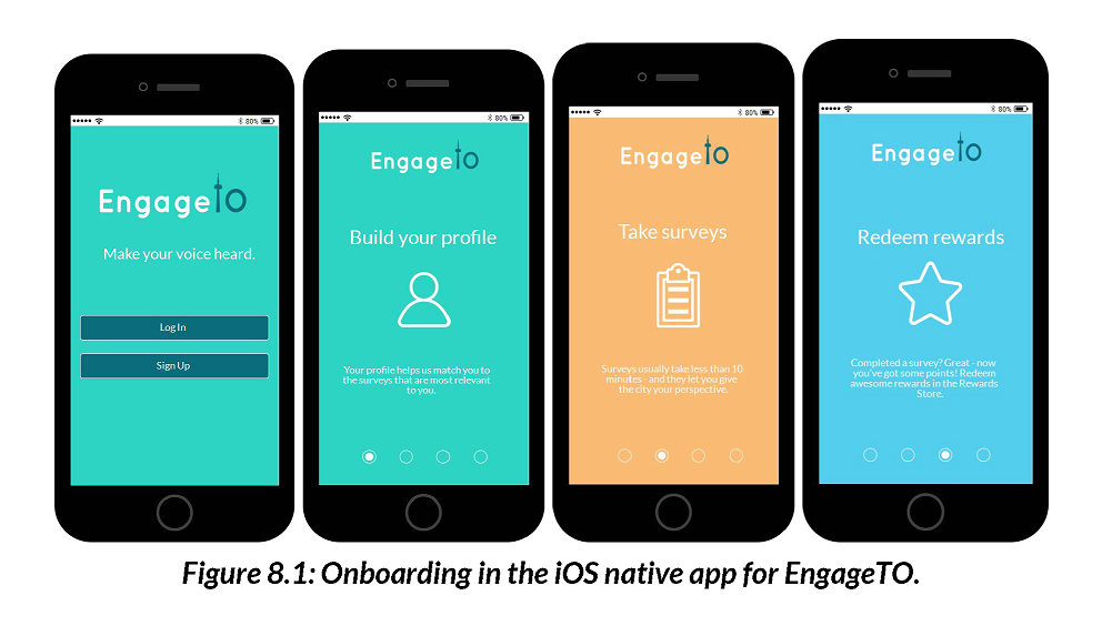
From here, the group moved on to the high-fidelity prototypes, taking into account feedback received through the heuristic evaluation and the usability testing session. While the desktop and smartwatch designs were mainly updated to include visual design elements, the mobile experience was significantly overhauled due to feedback received. At this stage, the adaptive mobile website was scrapped in favour of a fully realized iOS native mobile application.
Conclusion & Future Work:
Overall, the group was able to move through an entire design process, from ideation, to low-fidelity sketches, all the way through to high-fidelity clickable prototypes with a large and exhaustive requirements set. Our ideas were iterated upon during our 12 week course and include several more screens than were presented here.
Future work on this project could include further user research to validate the idea of the EngageTO platform, strategic consultation and partnerships, an implementation of things outside of the scope of the minimal viable product such as events and geo-location, and the design of an administrator view.


