Student experience map & UI overhaul for UofT Career Centre.
Overview:
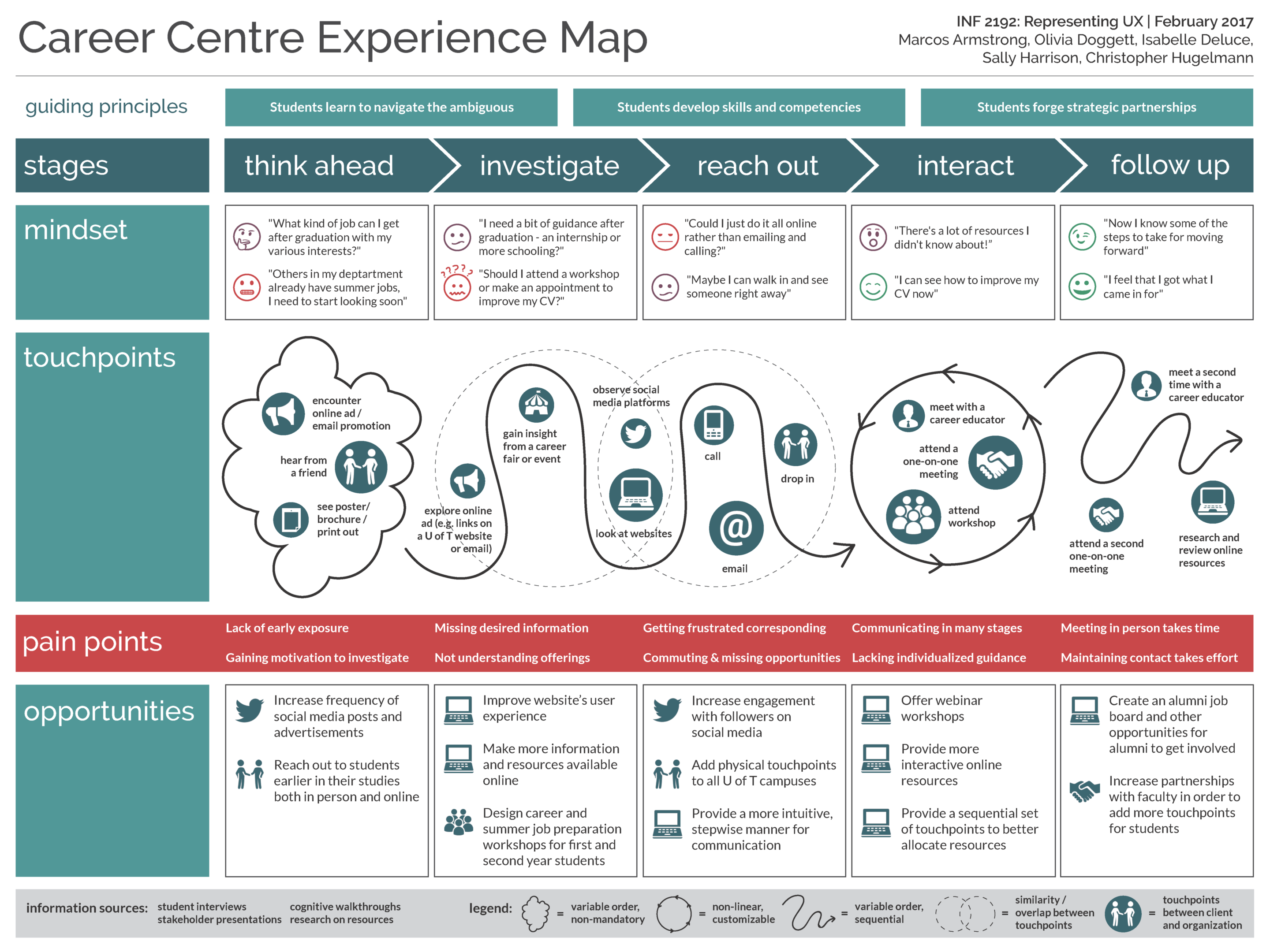
A group of colleagues and I worked with the University of Toronto’s Career Centre to create a customer experience map to help align the Career Centre’s goals with expectations and experiences of the user. The group was meant to discover the typical experience of a student looking to interact with the Career Centre for advice and assistance in moving forward with job prospects. The project was done in collaboration with UofT’s Career Centre, therefore this was meant to help focus the Career Centre’s initiatives and offerings moving forward.
Initial Consultation and Interviews:
After a 1-hour session with 3 members of the Career Centre to discover more about the task at hand and the expectations of the stakeholders, the group was tasked with interviewing several students that were utilizing the Career Centre to better understand their thoughts and feelings. This was done over the course of two weeks, where group members met with various students at differing stages of their education and career timelines and asked about their experiences with the Career Centre. Many of the interviewees had never met with the Career Centre, which was informative in its own right, and it was discovered that once contact had been made, the experience was positive; unfortunately, many did not reach out or were not reached out to in a way that made sense for the students.
Initial Customer Experience Map:
After collating the information from several interview sessions, the group then started forming a rough outline of the eventual customer experience map (more specifically, an alignment diagram) to consolidate a final hand-in to deliver to the Career Centre. The initial customer experience map took the better part of 2 days work to create a legible map that concisely showcased what our interviewees had expressed to us. The first day was spent creating affinity mappings to create general categories and to discover an approximate timeline for interactions with the Career Centre. The second day was spent formalizing the structure and explicitly filling in the different sections of the experience map.


Final Customer Experience Map:
The finalized customer experience map was submitted to the Career Centre for review. It incorporated our findings for how users go through their experience, such as which stages take place in the process; what users are thinking and feeling during each stage; what the user is doing and which touchpoints are utilized during each stage; pain points that were identified through interviews; opportunities for the career centre to minimize pain points.

We then worked on redesigning the University of Toronto’s Career Navigator website using a lean UX methodology.
Through a design studio workshop, our team was able to outline the three main goals of the Career Navigator:
- Explore career options based on your department/degree
- Discover what competencies you possess
- Connect with alumni in your field
Our vision for the site was a way to bridge two important services that the Career Centre offers, namely: career information and skills related to students’ academic departments and alumni connections that students can network with.
From our previous work of creating an experience map, we discovered some areas of improvement that could be translated onto the Career Navigator site. The three main areas of opportunity we discovered through our experience map and looking at the current Career Navigator site were:
- Access to actionable networking resources
- Wider, more flexible and accessible information architecture
- Higher visibility of online offerings and tools
Assumptions:
Through our lean UX methodology, we crafted several assumptions to base our work of off, given the short turn around time. This gave the group an opportunity to place ourselves in the shoes of the user.

Proto-personas:
Next, my colleagues and I created proto-personas, which included demographic/psychographic information, behaviours or actions of the persona, and outlining their needs and pain points.

Hypotheses testing:
The group crafted two hypotheses statements that directed the redesign of the Career Navigator website, informed by the proto-personas and assumptions we had made.
- Does redesigning the information architecture of the site to be wider, rather than deeper and siloed, increase user’s perceptions of the site’s ease-of-use, navigation, clarity and usability?
- Does adding a “how to network” guide for building skills lead users to feel more confident for career preparation and networking?

Low-fidelity prototyping:
Each group member sketched 6 separate screens that were tailored to either one or both of our hypotheses. Each member showcased their screens and gave a brief explanation of them, and the group discussed the merits and drawbacks of each. Eventually, ideas from all were written down to clarify what would be shown within our redesign.

Medium-fidelity prototyping:
The group then created our medium-fidelity prototype, based on the sketches and information we had gathered up until that point. We kept some of the basic functionality that already existed on the current Career Navigator page, while also implementing changes informed by our hypotheses statements and personas.
After the group moved our medium-fidelity prototype from sketches and whiteboard design and into Axure, we moved on to usability testing. We crafted a usability testing protocol that looked at validating the fit between our screens as they related to the hypotheses we had crafted. In total, six University of Toronto students participated, filling out a pre- and post-test questionnaire, as well as completing pre-determined tasks with a think-out-loud mentality.

After further iteration based on these findings, the group submitted the finalized version of our medium-fidelity prototype for review by the Career Centre.

To view the MVP that was delivered to the University of Toronto’s Career Centre, click here.

